Twitter is finally joining the ranks of Google Plus and Facebook by changing its page design to include large banner images, better navigation and blocks. It’s been a long time since Google Plus and Facebook changed their designs and now, Twitter is finally joining the party. This should be a celebration for businesses and marketers.
No matter what I tried to do with the previous design, my Twitter profile didn’t come out looking like a winner, until I gave up. Today, my inbox contained an invitation from Twitter to try the new design and I found everything I’d been looking for:
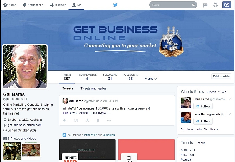
- Large banner image, which can be used for branding – it looks great on a desktop, shrinks to fit on Android mobiles, but doesn’t seem to be displayed on iPhones and iPads (I’ve only emulated the different devices)
- Better use of page space – rather than focusing everything on the tweet stream, Twitter has made good use of navigation levels and blocks to show more in the same space, while being responsive
- You can now “pin” a tweet to your profile page and it will show at the very top
- The most recent tweet appears next (or at the top, if nothing is pinned), then the two profiles you followed most recently, and then by the rest of your tweets
- The tweet feed contains only original tweets. Switching to “tweets and replies” is just a click away
- Photos and videos are given as much space as they would on Google Plus and Facebook
- Followed/following profiles are shown as 3 colourful blocks in a row
For those using a rather small desktop computer or laptop, Twitter not fit to the page, but this new design certainly caters much better for larger screens and high resolutions than the old one did.
It took a few attempts to get the banner right, so here are a couple of tips:
- You can zoom the image in, but not out, and you can reposition it, so start with an image that shows what you want somewhere around the middle, with lots of good background around it, especially on the sides, and then position and zoom until Twitter shows what you want
- To get the most out of your profile block as it appears in other people’s followed/following lists, position your brand symbol a little to the right and a little higher than the middle. You can check what it looks like on your home page. This may take a few iterations, but the result is quite pleasing, especially when combined with a suitable background colour
You can see the result here.
Happy tweeting,
Gal
Leave a Reply